The Contract Explosion
The timeline has shown us the events that spurred the salary booms in Major League Baseball, but it’s hard to truly grasp this using words alone. Thus, we turn to visualizations, every data nerd’s favorite entrée, to understand the escalation of contracts since the beginning of free agency. Most of the visualizations on this page are interactive, so hover over the points for more details.
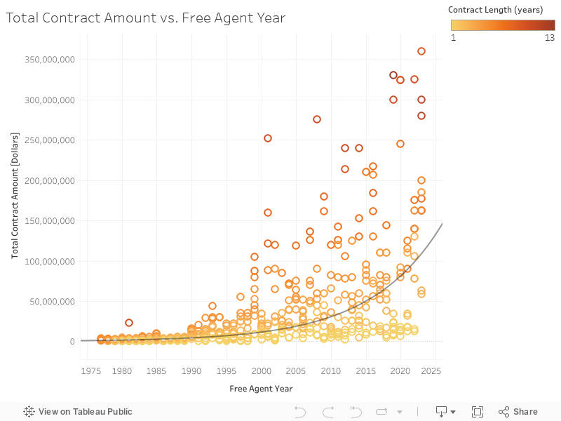
First, we graph this in the simplest way: comparing the total amount of a contract by the year it was handed out. Clearly, player earnings have grown exponentially, as the data points follow the trend line fairly well. The R^2 value is about .58, meaning that the points follow the exponential trend line moderately well. The points are colored by the length of the contract, with a lighter color corresponding to a shorter contract.
You might be thinking, “Wouldn’t this massive jump just be due to inflation? The value of the dollar is not the same as it was thirty, forty years ago. Surely, the exponential growth is just a result of that.” You’re not completely wrong. Inflation has absolutely impacted contracts and how they are perceived. If we recall the events on the timeline, we remember that Alex Rodriguez signed a contract worth $252 million in 2001, and Aaron Judge signed one worth $360 million in 2023. Judge got paid over $100 million more on the surface. But adjusting for inflation, Rodriguez’s contract was actually worth close to $430 million in today’s money. So now let’s look at that graph again, this time accounting for inflation.
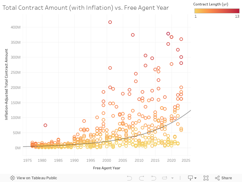
The exponential curve is a little flatter and the data deviate more from it, but other than that, the two graphs are very similar. The R^2 value of .41 shows that the data are not as well-represented by an exponential model, and thus inflation has had an effect. However, we can still see a very noticeable jump in total contract amount around the turn of the century. It’s safe to say that while inflation has absolutely contributed to the meteoric rise of contracts, it’s far from the main factor. The MLB market has just exploded, and that is well-reflected in these contracts.
When it comes to analyzing relationships between predictor variables (year, statistics, etc.) and the response variable (contract dollar amount), the relationship between free agent year and total dollar amount is probably the first thing that comes to mind. But what’s next? What else plays a role in how much money a player earns in free agency? Even before we dive into stats, we should first look at a few player characteristics.
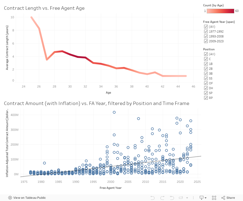
The dashboard on the left features two visualizations. The top one is a line graph showing the relationship between the age of a player and the length of the contract he receives. As a player gets older, teams are less willing to give him a long contract, fearing that his performance might decline in the future. The color of the line corresponds to the number of observations in the data set with a certain age. For instance, there were 60 occurrences of 31-year-olds signing free agent deals in the data set, and so at age 31, the line is a dark shade of red. On the other hand, the aforementioned Rodriguez is the only player in the data set to have signed a contract at age 25. Thus, at age 25, the line is the palest shade of red. Additionally, the two filters on the right allow you to toggle between positions and spans of years. Notice that unclicking an option removes all occurrences of that option from the graph.
Below the line graph is a scatter plot, and it might look very familiar. It’s the same plot as before, featuring year and total dollar amount adjusted for inflation. But instead of the color representing contract length, we now apply the filters. Additionally, the trend line has switched from exponential to linear. This is done to foreshadow the predictive model on a coming page. Switch between the time frames and see how deals change from one fifteen-year period to the next. Toggle between positions as well. Use the linear regression to see how relationships change with the addition or removal of certain characteristics. Are there any that you would say significantly change a linear model?
Lastly, we have to take a step back and search for context. Sure, Alex Rodriguez inked a deal for $252 million. But without context, $252 million is just a really big number. How does A-Rod’s contract compare to the average major leaguer? The average U.S. family? Take a look at the graph below courtesy of Expensivity and how different MLB salaries compare to the average family. Note that the graph compares annual salary and not total contract amount.
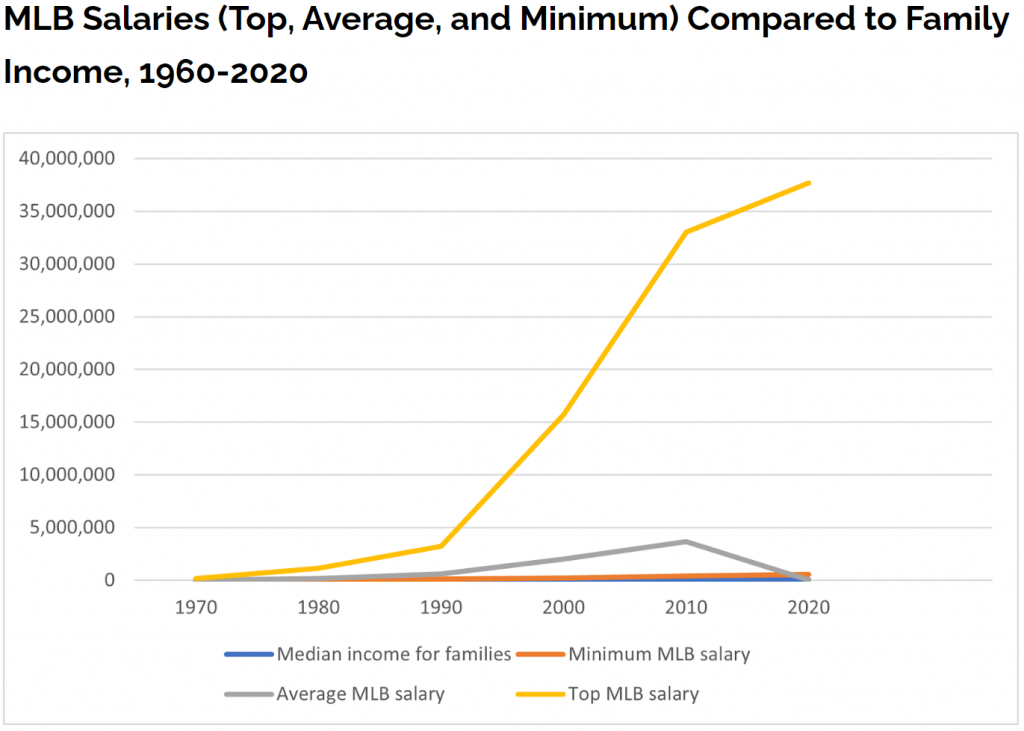
The top MLB salary skyrockets after 1980, while the average and minimum wages stayed relatively close to the family’s income. The average experiences an interesting little peak around 2010 and then drops back down. A COVID-shortened season in 2020 might be the cause of that dip. Because the average is as low as it is, it is clear that $30+ million salaries are extreme cases.